Back to the Drawing Board
An Ode to the Imperfect Start
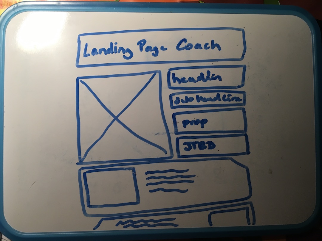
That’s how I find myself back to the drawing board: facing a blank page with the goal to build a landing for .. precisely the landing page coach ap.
I’m not different from everyone else: I fear an empty page.
How strange that voidness be a challenge? It’s because out desire it to see it filled and perfect.
Should I start with the design in Figma? or the copy in a Google Doc? Or that’s already too advanced and I should go back to the mission, the value prop and the personas?
It’s a chicken an an egg problem.
- Copy will influence Design
- Design is the most satisfying to start with
- Coding will come later but it’s the most tangible
- but in fact the message is what should come first
- but it’s hard to drill down in the message
None of them.
I was reminded by a sane tweet from @wonjitos and later again by @Patrik.
Before designing, I always do this:
— Wonji (@wonjitos) March 5, 2024
1. Draw wireframes by hand
2. Write copy referring to Chat GPT
3. Choose typefaces & colors based on the brand pic.twitter.com/IeaRXFStx1
One thing that im about to experiment when designing landing pages for clients.
— Patrik (@NordicPatrik) March 7, 2024
Before designing the page on Figma or Webflow.
Ima draw that sh*t down. Get it all out on paper.
Ignore my horrible handwriting haha but this is such a no brainer designer hack. pic.twitter.com/XquUN4SMMc
The rule is simple:
-
Start with pen and paper
-
sketch a few rectangles for
- headline
- sub headline
- intro
- your CTA
-
ideate some ideas of the words to use
Do it as if you were designing a poster for your 10th birthday party
make it imperfect, with typos, use sharpies with bright colors
Once there two questions will come
-
What do you really want to say and to whom. Imagine you have him/her in front of you
-
What is the transformation you offer. what is most urgent problem, the mindset of the majority people reaching this page have. Be conscious that they will not come rom the blue sky but rom the efforts you do to promote your page. So in a way, you know them already.
Make an educated guess, don’t overthink it because only experience will tell you wo really reaches your page. It’s more important to iterate quickly than do do well from first try.
Your copy should perform 3 things
- Hook visitors to read more. 3 seconds.
- Warm up their needs they may have forgotten for a while
- Move them toward clicking on the CTA button
The design
- must be welcoming, clean like a nice café
- must support and amplify te proposition or the problem
- demonstrate you can do it
Keep in mind
- It’s never finished, never perfect.
- It’s a constant wip
- Don’t try to think it all in one go
- Build by steps like some people build their house level after levels.
As per layout
- all aligned
- with a small difference, a personal touch there are not many choices. Templates from popular apps cover them all.
Since the CSS Zen Garden we know that we can transform one design into another without touching the text again. Key elements stays the same especially if you use semantic markup, and that’s what Google wants too.
Design and Copy are a flexible mix
Finally we need a platform and if you can read this post it’s because I made a choice after a long time of indecisiveness ( a polite word for procrastination).
I didn’t want to start again with WordPress. If only because I’m bored of it.
Read the next post in my story: Starting With Astro.
PS: If you don’t know how to start sketching a web page, @krisztaszerovay made a beautiful and cheap course on Udemy to teach you an easy way, accessible to everyone, to start sketching. It’s called Sketching For UX . Even if you don’t design the site yourself, or your use templates, this will help you ideate and communicate with your designer.
PS2: Monday Dan ( @d4m1n ) and Sandra (@TakoTreba ) covered this topic in their podcast at 7 min, “Back to Basics: The Power of Pen and Paper in Design”.
They were commenting on this tweet.
I usually dive into coding for my designs and iterate from there.
— Mikkel Ulstrup (@themikkelu) March 11, 2024
But sometimes, I switch it up and sketch it out on paper. Never in Figma or Sketch.#buildinpublic #iosdev #typefully pic.twitter.com/ZUinbdQO6l
You can find the printable wireframe at
Charlie ( @CharlieYalf ) was faster than me to create the meme they described. Here is the result: It summarizes well the post.
Listening to @morningmakersho and @d4m1n spent time talking about it, so I had to make it.#buildinpublic pic.twitter.com/ipnrAfQiMP
— Charlie (@CharlieYalf) March 11, 2024
Read the next post in my story: Starting With Astro.