Paleo Landing Page
Let’s elaborate on the analogy between your landing page and a human face. When we see others, we look at their faces for multiple signals.
More specifically, we focus on the first section of the page. What is called the hero section,
Imagine traveling by foot from your tribe’s place in the woods to another tribe in the mountains. I can’t carry much.
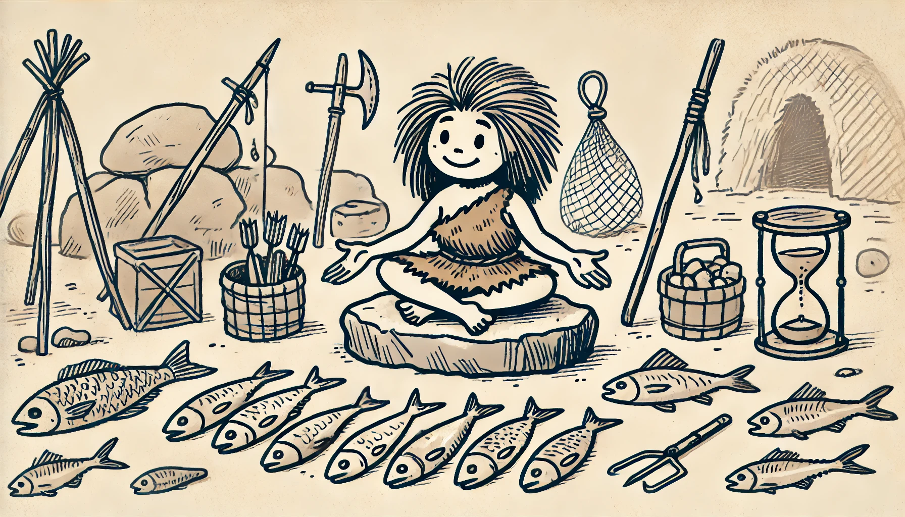
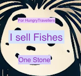
Imagine the scene: 5000 years ago, there was no money yet. Trade happens by barter: exchanging goods and services directly. You are hungry, and you spot a woman seated on a rock selling fish in front of her.
To engage, we look in the eyes of the other at the same time as we talk.
Eye contact is not fixed on the pupils of the other but a whole sight centered around the eyes. It’s similar to us skimming the page before reading.
Your landing page is your face of the time before the Internet. More specifically, is the face above the fold of your page? What I can see without moving my own head or reaching to it. More precisely, it is the hero section of your page.
When people reach your page, the first thing they look at is your eyes, which on your page is the headline. Not at the exact top of the page (think the hair), but a few fingers width below. If the eyes are inviting and engaging, we keep looking. If we are unsure if the lady is selling her fish or just drying them, we look around for her expression.
What’s best to convey the expression outside of the yes?
Eyebrow and mouth. The lady’s mouth will end up telling me what she wants in exchange for the fish. Mind that it could be in a language but maybe not a common one. We often have this experience when traveling in foreign countries and visiting shops and markets.
That’s the CTA, the Call To Action, the big button.
So before we expect words coming from the mouth, eyebrows are good silent indicators of how my inquiry is welcome.
On your page, the eyebrow is this little text above the headline, often unnoticed and forgotten by designers.
Eyebrow copy is helpful to confirm visitors they are in the right place? It’s usually a call out to their category and persona via their worldviews. Feedback for small businesses says our website If you’re a designer, a coder, or a large corp, it’s likely not for you.
The lady selling fish, flattening her eyebrow, expresses the idea that my attitude fits her view of a potential buyer. Maybe she would frown on a regular customer who didn’t honor his side of the deal or to a beggar. Now, it’s time to evaluate the trust of this fish provider. The fish itself has been inspected, which would be like a picture in the hero section. It is covered with a red mix of spices and herbs to protect it from the numerous flies around. Like I saw during my teenage trip to South India. It must be a few hours old, perfect to negotiate a deal.
That’s like the subheadline copy on your hero section.
I look at her face, she looks well fed, in good health, so her fish must be good.
If I’m not convinced to proceed to the negotiation and trade, I would look around, maybe her chest or arms. Is she strong? Does she sell her own catch or get it from elsewhere and only sell it? Are other buyers around or nearby?
That’s when you see the importance of UI, UX, and Visuals. They convey meanings and signals your words didn’t.
She is surrounded by fishing utensils, a net, and some lines with hooks. So, she seems to be in the proper position to sell fish. She has authority.
That’s when you scroll down the page. It’s unclear what you will get, from whom, if other’s bought before. Trade is a social activity, like learning.
Further around are leftover fish. That’s her testimonial that her fish are good. The cloud of lies also contributes to building trust. Similar to the likes and followers we garner on social media.
Scrolling is the sign you need reassurance by having further detail on the offer or testimonials from others our your resiudual obections handled.
If I know you already, I’ll likely buy without scrolling. I would click the CTA directly.
Same for this fish merchant, once we agree on what service or good I can provide, like a stone I sharpened. It’s even possible for such a great item I will have some credit for a further deal.
What I illustrated in this story, deliberately placed in a context of simple human interaction, is how basic landing pages are. They are based on the same psychology and behaviors that have been around for thousands of years.
Sales have been around before money, abstract languages, abundance of goods.
When you look at landing pages, think of faces. Do they look nice, engaging, inviting?
People sometimes compare it with a front door, the front of a building. I think it’s wrong. The best metaphor is way older and more relevant.
Next time you look at a landing page, imagine a face behind it with the eyes on the headline and the mouth on the CTA.
Does it speak to you?
Good pages elicit a conversation in your visitor’s mind. Something illustrated by one funny feature inside the landing page coach.
It’s not a message being broadcast but a back-and-forth between your page elements, the questions your visitor voices in silence, and his inner talk that translates what he read into feelings.
There is anachronism on the picture, did you spot it?